Plot the results of a Category-Series structured DQL query (with an artibrary number of Series columns) on a line or bar chart.
Plot a Category-Series dataset
Warning - Extra plugin required
This visualisation requires the Obsidian Charts plugin to implement the integration between Dataview and Charts.js.
To minimise the need for additional plugins when browsing the example vault, images have been included alongside the JS code.
Help - Query Structure
For this type of chart, the query should return at least two columns (but unlimied additional columns are supported).
The first column should represent the *X-Category* labels for the chart, and each subsequent column should represent a different data *Series*. The column name is used as the *Series* name on the chart.
Basic
Wellbeing chart by day (from daily notes)
DQL Query Results
TABLE WITHOUT ID
    file.name as "Date",
    wellbeing.mood as "Mood",
    wellbeing.health as "Health",
    wellbeing.pain as "Pain"
FROM "10 Example Data/dailys"
WHERE date(file.name).year = 2022
SORT file.name
LIMIT 5
Chart Results
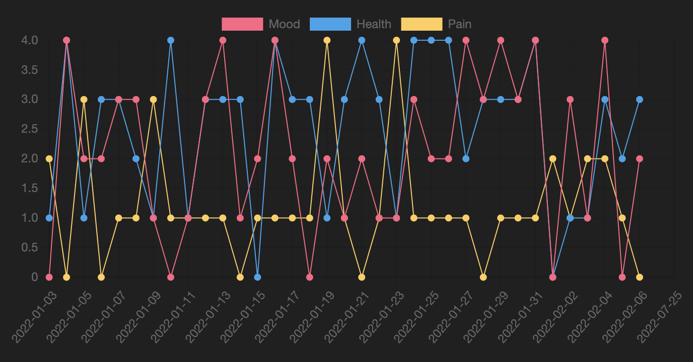
DataviewJS
``` //dataviewjs
// -----
// BASIC SETTINGS
// -----
let showTable = false; //show table below chart or not
let chartType = 'line'; //bar or line
let xAxis = "xAxis: {type:'time', time: {unit: 'day'}}"; //{type:'category'}";
let yAxis = "yAxis: {suggestedMin: 0, ticks: {stepSize: 1}";
let autoLabels = true; //auto lables, or use list below
var labels = ["Mon", "Tue", "Wed", "Thu", "Fri", "Sat", "Sun"]; //only matter if above is false
var colors = [['#ff6384'],['#36a2eb'],['#ffce56'],['#4bc0c0'],['#9966ff'],['#ff9f40']]; // Unique colours for up to 6 series; then repeats
let sDQL = '\
TABLE WITHOUT ID \
file.name as "Date", \
wellbeing.mood as "Mood", \
wellbeing.health as "Health", \
wellbeing.pain as "Pain" \
FROM "10 Example Data/dailys" \
WHERE date(file.name).year = 2022 \
SORT file.name'
// -----
// BELOW HERE IS LARGELY AUTOMATIC
// -----
let DQL = await dv.tryQuery(sDQL);
//extract necessary data columns from above results
var allRows = DQL.values;
var allLabels = allRows.map(r => r[0]);
var allSeries = DQL.headers.slice(1);
//extract labels automatically if required
if (autoLabels) {
labels = allLabels;
}
//cylce through each series to produce a dataset
var datasets = [];
for (let i = 0; i < allSeries.length; i++) {
let seriesName = allSeries[i];
let backCol = colors[i%colors.length];
let bordCol = colors[i%colors.length];
let bWidth = 1;
var dataPoints = [];
if (!autoLabels) {
    //map each datapoint to a label in the fixed array
    dataPoints = labels.map(l => {
        let labelIndex = allLabels.indexOf(l);
        if (labelIndex < 0) { return 0 }
        else { return allRows[labelIndex][i+1] }
    })
} else {
    //dataPoints already align with labels
    dataPoints = allRows.map(r => r[i+1]);
}

//create a dataset to graph
let chartDataset = {label: seriesName,
                    data: dataPoints,
                    backgroundColor: backCol,
                    borderColor: bordCol,
                    borderWidth: bWidth};

datasets.push(chartDataset);
}
//Make the xAxis category based, if we are using a fixed array of labels
xAxis = (autoLabels ? xAxis : "xAxis: {type:'category'}");
//graph the datasets using standard chart.js syntax
const chartData = {
type: chartType,
data: {
labels: labels,
datasets: datasets
},
options: {
scales: { xAxis, yAxis }
}
}
window.renderChart(chartData, this.container);
dv.span("");
if (showTable) { dv.table(DQL.headers, DQL.values) }
## Variants
### Average Wellbeing chart by day-of-week (from daily notes)
#### DQL Query Results
``` dataview
TABLE
    round(sum(MoodValues)/length(MoodValues), 1) AS Mood,
    round(sum(HealthValues)/length(HealthValues), 1) AS Health,
    round(sum(PainValues)/length(PainValues), 1) AS Pain
FROM "10 Example Data/dailys"
GROUP BY dateformat(date(file.name), "ccc") as "DayOfWeek"
FLATTEN list(filter(rows.wellbeing.mood, (x) => x)) as MoodValues
FLATTEN list(filter(rows.wellbeing.health, (x) => x)) as HealthValues
FLATTEN list(filter(rows.wellbeing.pain, (x) => x)) as PainValues
SORT date(rows[0].file.name).weekday
Tip - Calculating Averages
DQL does not (currently) have an avg() function, however sum()/length() can be used.
Tip - Using FLATTEN to Clean-up Input Data
Its possible that individual daily notes will have some, but not all, of the three values above. In these cases sum(...) will return an error and the entire group will be omitted from results. Additionally, length(...) will count the rows even when no data is present.
To sanitise the data before calculating the average, `FLATTEN` can be used to filter out any missing data and create new sanitised arrays to perform statistics on. This process could technically be done directly in the `TABLE` statement itself; however the query becomes much harder to read.

The approach used here is:
`FLATTEN list(filter(rows.wellbeing.mood, (x) => x)) as MoodValues`
Which effectively reads (from the inside out), as: take all the (unsanitised) values collected for mood, filter them to only give values that 'exist', put them back into a new list, and name that list MoodValues. The `TABLE` statement is then free to perform clean statistics on the new MoodValues list.

Handling missing data before statistic functions isn't necessary in cases where you are sure the data will exist; or that no 'undefined' data will make it to the `sum()`, `min()`, `max()`, or `length()` functions.
Chart Results
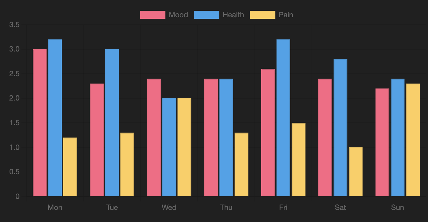
DataviewJS
``` //dataviewjs
// -----
// BASIC SETTINGS
// -----
let showTable = false; //show table below chart or not
let chartType = 'bar'; //bar or line
let xAxis = "xAxis: {type:'category'}"; //{type:'time', time: {unit: 'day'}}";
let yAxis = "yAxis: {suggestedMin: 0, ticks: {stepSize: 1}";
let autoLabels = false; //auto lables, or use list below
var labels = ["Mon", "Tue", "Wed", "Thu", "Fri", "Sat", "Sun"]; //only matter if above is false
var colors = [['#ff6384'],['#36a2eb'],['#ffce56'],['#4bc0c0'],['#9966ff'],['#ff9f40']]; // Unique colours for up to 6 series; then repeats
let sDQL = '\
TABLE \
round(sum(MoodValues)/length(MoodValues), 1) AS Mood, \
round(sum(HealthValues)/length(HealthValues), 1) AS Health, \
round(sum(PainValues)/length(PainValues), 1) AS Pain \
FROM "10 Example Data/dailys" \
GROUP BY dateformat(date(file.name), "ccc") as "DayOfWeek" \
FLATTEN list(filter(rows.wellbeing.mood, (x) => x)) as MoodValues \
FLATTEN list(filter(rows.wellbeing.health, (x) => x)) as HealthValues \
FLATTEN list(filter(rows.wellbeing.pain, (x) => x)) as PainValues \
SORT date(rows[0].file.name).weekday'
// -----
// BELOW HERE IS LARGELY AUTOMATIC
// -----
let DQL = await dv.tryQuery(sDQL);
//extract necessary data columns from above results
var allRows = DQL.values;
var allLabels = allRows.map(r => r[0]);
var allSeries = DQL.headers.slice(1);
//extract labels automatically if required
if (autoLabels) {
labels = allLabels;
}
//cylce through each series to produce a dataset
var datasets = [];
for (let i = 0; i < allSeries.length; i++) {
let seriesName = allSeries[i];
let backCol = colors[i%colors.length];
let bordCol = colors[i%colors.length];
let bWidth = 1;
var dataPoints = [];
if (!autoLabels) {
    //map each datapoint to a label in the fixed array
    dataPoints = labels.map(l => {
        let labelIndex = allLabels.indexOf(l);
        if (labelIndex < 0) { return 0 }
        else { return allRows[labelIndex][i+1] }
    })
} else {
    //dataPoints already align with labels
    dataPoints = allRows.map(r => r[i+1]);
}

//create a dataset to graph
let chartDataset = {label: seriesName,
                    data: dataPoints,
                    backgroundColor: backCol,
                    borderColor: bordCol,
                    borderWidth: bWidth};

datasets.push(chartDataset);
}
//Make the xAxis category based, if we are using a fixed array of labels
xAxis = (autoLabels ? xAxis : "xAxis: {type:'category'}");
//graph the datasets using standard chart.js syntax
const chartData = {
type: chartType,
data: {
labels: labels,
datasets: datasets
},
options: {
scales: { xAxis, yAxis }
}
}
window.renderChart(chartData, this.container);
dv.span("");
if (showTable) { dv.table(DQL.headers, DQL.values) }
```