Plot the results of a Series-Category-Value structured DQL query on a line or bar chart.
Plot a Series-Category-Value dataset
Warning - Extra plugin required
This visualisation requires the Obsidian Charts plugin to implement the integration between Dataview and Charts.js.
To minimise the need for additional plugins when browsing the example vault, images have been included alongside the JS code.
Help - Query Structure
For this type of chart, the query should return three columns representing the Series Name, X-Category, and Y-Value.
To produce a table like this, often the best approach is to `GROUP BY` the first and second field in a combined way - then split these back into two columns in the TABLE statement itself. This can be done in several ways, but often it is easiest to call on `rows[0]` for these values. After a `GROUP BY` operation, `rows[0]` will represent the first result inside each group. For Series and Category values (column 1 and 2), we know that all rows in the group will have the same values - so refering directly to the first one is ok.

This approach is used in the Basic example below, where data is grouped by Year-Month (to count how many projects are started each month), then this is plit into a Year and Month column for processing onto the chart.
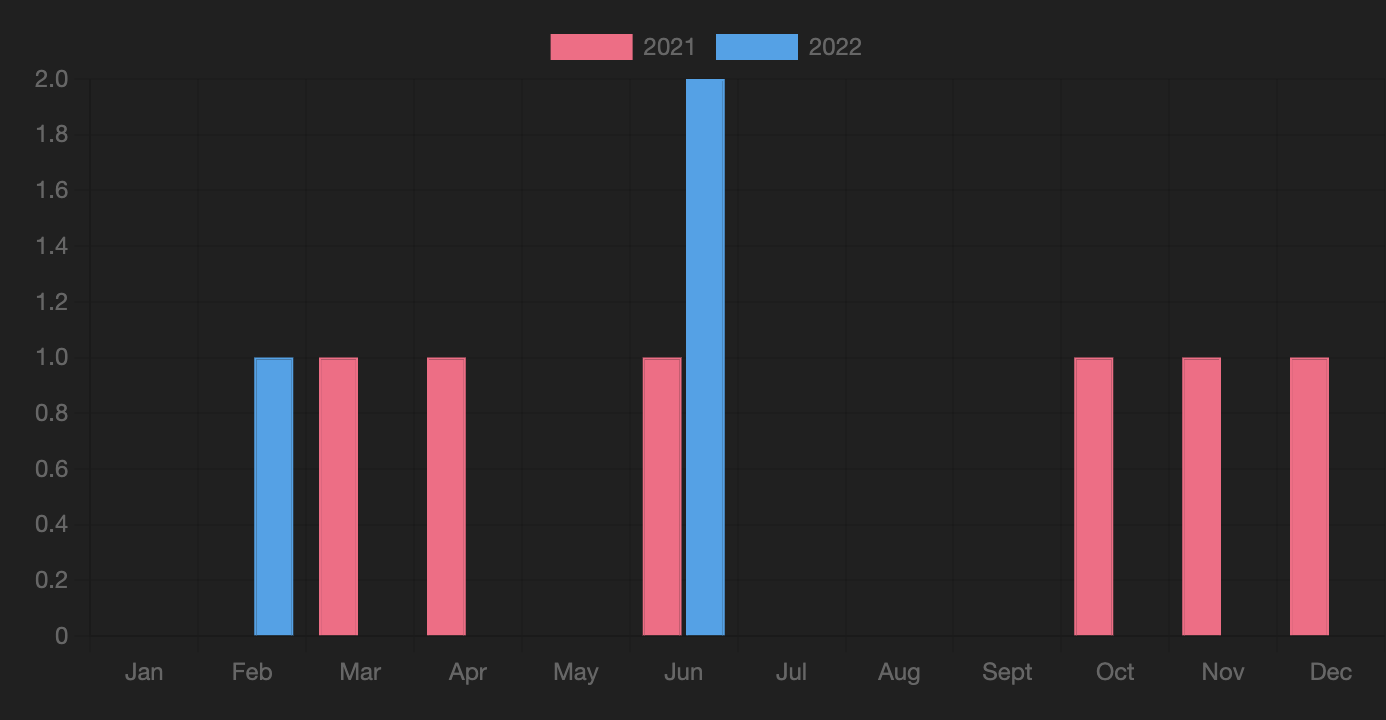
Basic
Projects started by month and year
DQL Query Results
TABLE WITHOUT ID
    dateformat(rows[0].started, "yyyy") AS Year,
    dateformat(rows[0].started, "MMM") AS "Month",
    length(rows) as "Projects"
FROM "10 Example Data/projects"
GROUP BY dateformat(date(started), "yyyy-MM") AS YearMonth
SORT YearMonth desc
LIMIT 5
Chart Result
DataviewJS
``` //dataviewjs
// -----
// BASIC SETTINGS
// -----
let showTable = false; //show table below chart or not
let chartType = 'bar'; //bar or line
let xAxis = "xAxis: {type:'category'}"; //{type:'time', time: {unit: 'day'}}
let yAxis = "yAxis: {suggestedMin: 0, ticks: {stepSize: 1}";
let autoLabels = false; //auto lables, or use list below
var labels = ["Jan", "Feb", "Mar", "Apr", "May", "Jun", "Jul", "Aug", "Sept", "Oct", "Nov", "Dec"]; //only matter if above is false
var colors = [['#ff6384'],['#36a2eb'],['#ffce56'],['#4bc0c0'],['#9966ff'],['#ff9f40']]; // Unique colours for up to 6 series; then repeats
let sDQL = '\
TABLE WITHOUT ID \
dateformat(rows[0].started, "yyyy") AS Year, \
dateformat(rows[0].started, "MMM") AS "Month", \
length(rows) as "Projects" \
FROM "10 Example Data/projects" \
GROUP BY dateformat(date(started), "yyyy-MM") AS YearMonth \
SORT YearMonth desc'
// -----
// BELOW HERE IS LARGELY AUTOMATIC
// -----
let DQL = await dv.tryQuery(sDQL);
//extract necessary data columns from above results
var allRows = DQL.values;
var allLabels = allRows.map(r => r[1]);
var distinctSeries = dv.array(allRows).map(r => r[0]).distinct();
//extract labels automatically if required
if (autoLabels) {
labels = allLabels;
}
//cylce through each series to produce a dataset
var datasets = [];
for (let i = 0; i < distinctSeries.length; i++) {
let seriesName = distinctSeries[i];
let backCol = colors[i%colors.length];
let bordCol = colors[i%colors.length];
let bWidth = 1;
//get just the labels and values for this series
let thisSeriesRows = allRows.filter(r => r[0] == distinctSeries[i]);
let thisSeriesLabels = thisSeriesRows.map(r => r[1]);
let thisSeriesValues = thisSeriesRows.map(r => r[2]);

//for each label, find corresponding value from this series
let dataPoints = labels.map(l => {
    let labelIndex = thisSeriesLabels.indexOf(l);
    if (labelIndex < 0) { return 0 }
    else { return thisSeriesValues[labelIndex] }
});

//create a dataset to graph
let chartDataset = {label: seriesName,
                    data: dataPoints,
                    backgroundColor: backCol,
                    borderColor: bordCol,
                    borderWidth: bWidth};

datasets.push(chartDataset);
}
//Make the xAxis category based, if we are using a fixed array of labels
xAxis = (autoLabels ? xAxis : "xAxis: {type:'category'}");
//graph the datasets using standard chart.js syntax
const chartData = {
type: chartType,
data: {
labels: labels,
datasets: datasets
},
options: {
scales: { xAxis, yAxis }
}
}
window.renderChart(chartData, this.container);
dv.span(" ");
if (showTable) { dv.table(DQL.headers, DQL.values) }
## Variants
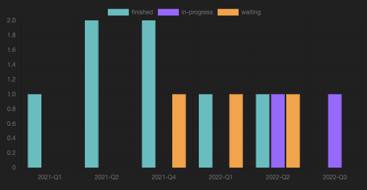
### 1. Project status by quarter
#### DQL Query Results
``` dataview
TABLE WITHOUT ID
rows[0].status as "Status",
dateformat(date(rows[0].started), "yyyy-Qq") as "Quarter",
length(rows) as "Projects"
FROM "10 Example Data/projects"
GROUP BY status + " " + dateformat(date(started), "yyyy-Qq")
LIMIT 5
Chart Result
DataviewJS
``` //dataviewjs
// -----
// BASIC SETTINGS
// -----
let showTable = false; //show table below chart or not
let chartType = 'bar'; //bar or line
let xAxis = "xAxis: {type:'category'}"; //{type:'time', time: {unit: 'day'}}
let yAxis = "yAxis: {suggestedMin: 0, ticks: {stepSize: 1}";
let autoLabels = true; //auto lables, or use list below
var labels = ["2021-Q1", "2021-Q2", "2021-Q3", "2021-Q4", "2022-Q1", "2022-Q2", "2022-Q3"]; //only matter if above is false
var colors = [['#4bc0c0'],['#9966ff'],['#ff9f40'],['#ff6384'],['#36a2eb'],['#ffce56']]; // Unique colours for up to 6 series; then repeats
let sDQL = '\
TABLE WITHOUT ID \
rows[0].status as "Status", \
dateformat(date(rows[0].started), "yyyy-Qq") as "Quarter", \
length(rows) as "Projects" \
FROM "10 Example Data/projects" \
GROUP BY status + " " + dateformat(date(started), "yyyy-Qq")'
// -----
// BELOW HERE IS LARGELY AUTOMATIC
// -----
let DQL = await dv.tryQuery(sDQL);
//extract necessary data columns from above results
var allRows = DQL.values;
var allLabels = dv.array(allRows).map(r => r[1]).distinct();
var distinctSeries = dv.array(allRows).map(r => r[0]).distinct();
//extract labels automatically if required
if (autoLabels) {
labels = allLabels.array();
}
//cylce through each series to produce a dataset
var datasets = [];
for (let i = 0; i < distinctSeries.length; i++) {
let seriesName = distinctSeries[i];
let backCol = colors[i%colors.length];
let bordCol = colors[i%colors.length];
let bWidth = 1;
//get just the labels and values for this series
let thisSeriesRows = allRows.filter(r => r[0] == distinctSeries[i]);
let thisSeriesLabels = thisSeriesRows.map(r => r[1]);
let thisSeriesValues = thisSeriesRows.map(r => r[2]);

//for each label, find corresponding value from this series
let dataPoints = labels.map(l => {
    let labelIndex = thisSeriesLabels.indexOf(l);
    if (labelIndex < 0) { return 0 }
    else { return thisSeriesValues[labelIndex] }
});

//create a dataset to graph
let chartDataset = {label: seriesName,
                    data: dataPoints,
                    backgroundColor: backCol,
                    borderColor: bordCol,
                    borderWidth: bWidth};

datasets.push(chartDataset);
}
//graph the datasets using standard chart.js syntax
xAxis = (autoLabels ? xAxis : "xAxis: {type:'category'}");
const chartData = {
type: chartType,
data: {
labels: labels,
datasets: datasets
},
options: {
scales: { xAxis, yAxis }
}
}
window.renderChart(chartData, this.container);
dv.span(" ");
if (showTable) { dv.table(DQL.headers, DQL.values) }
```